I feel my perspective drawing is going smoothly, with a few hiccups on the way. I find that it is challenging to draw the lines so that the illusion is that it is 3-D. I feel like my street drawing is going well because I enjoy being able to create whatever I desire in a realistic pathway. I am happy with my street drawing. The hardest part about going from a shape drawing to a street drawing is grasping the other elements added.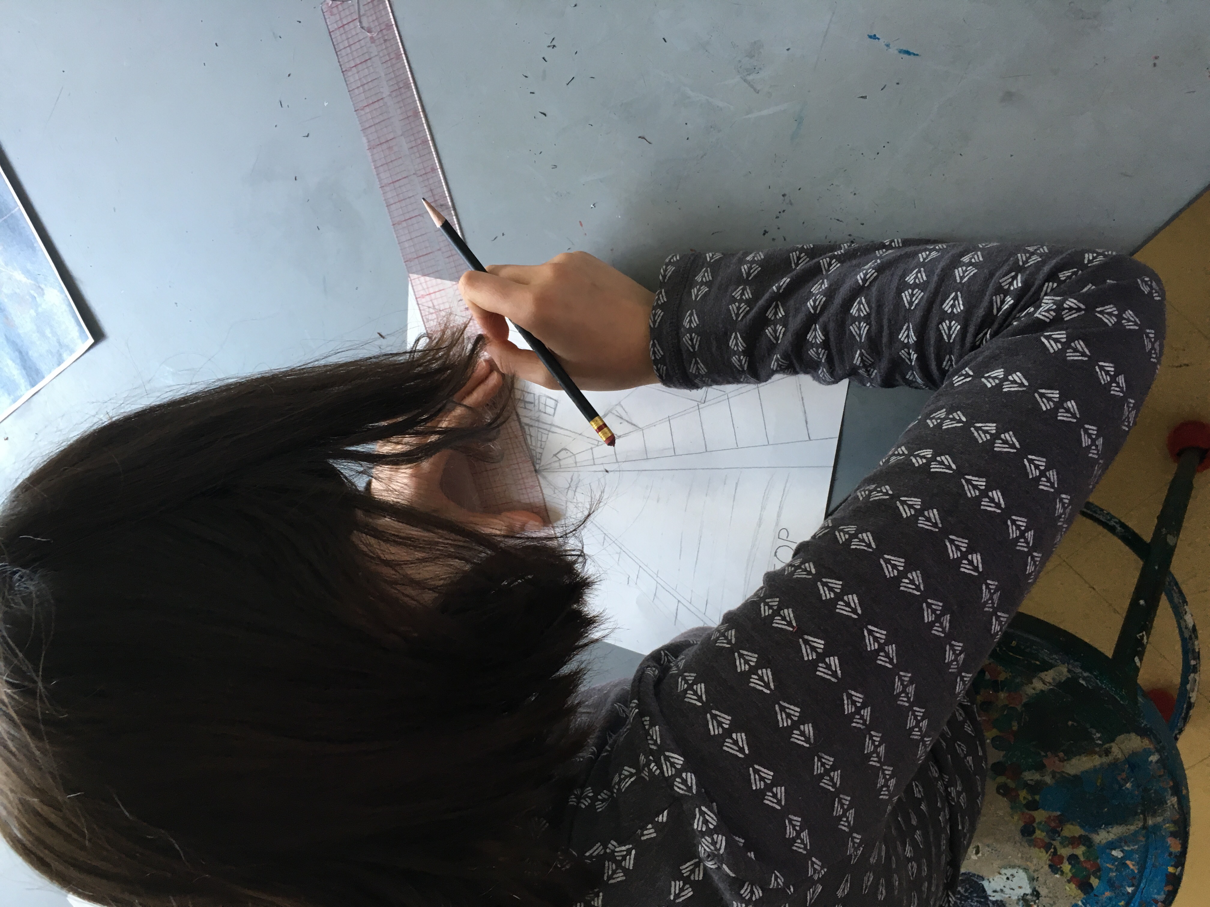
Category Archives: Demster
My Tomb Painting
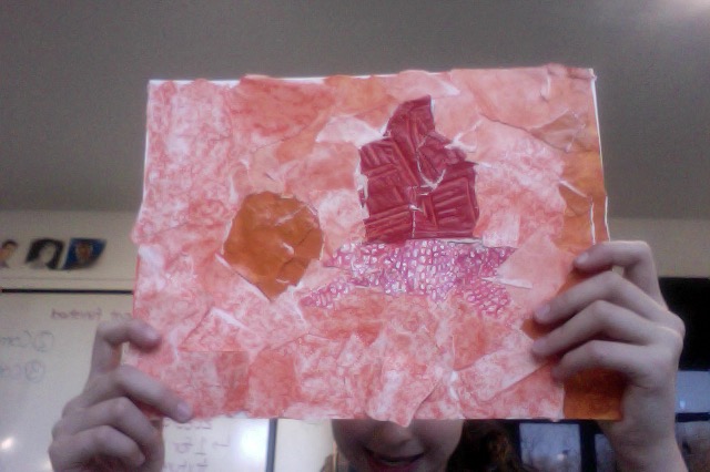
 This is my tomb painting that I made in art. We made our tomb paintings for our Egyptian Tomb because Egyptians would sketch pictures onto the walls of the tomb. We first sketched our idea for our picture then outlined it in sharpie. Finally we water colored our painting to give it a washed out look instead of painting it with another type of paint. My tomb painting is of Hatshepsut sitting on a throne with people worshipping her. She is wearing a nemes headdress (the sign of a pharaoh) because she wanted to be portrayed as a man instead of a woman.
My Ushabti
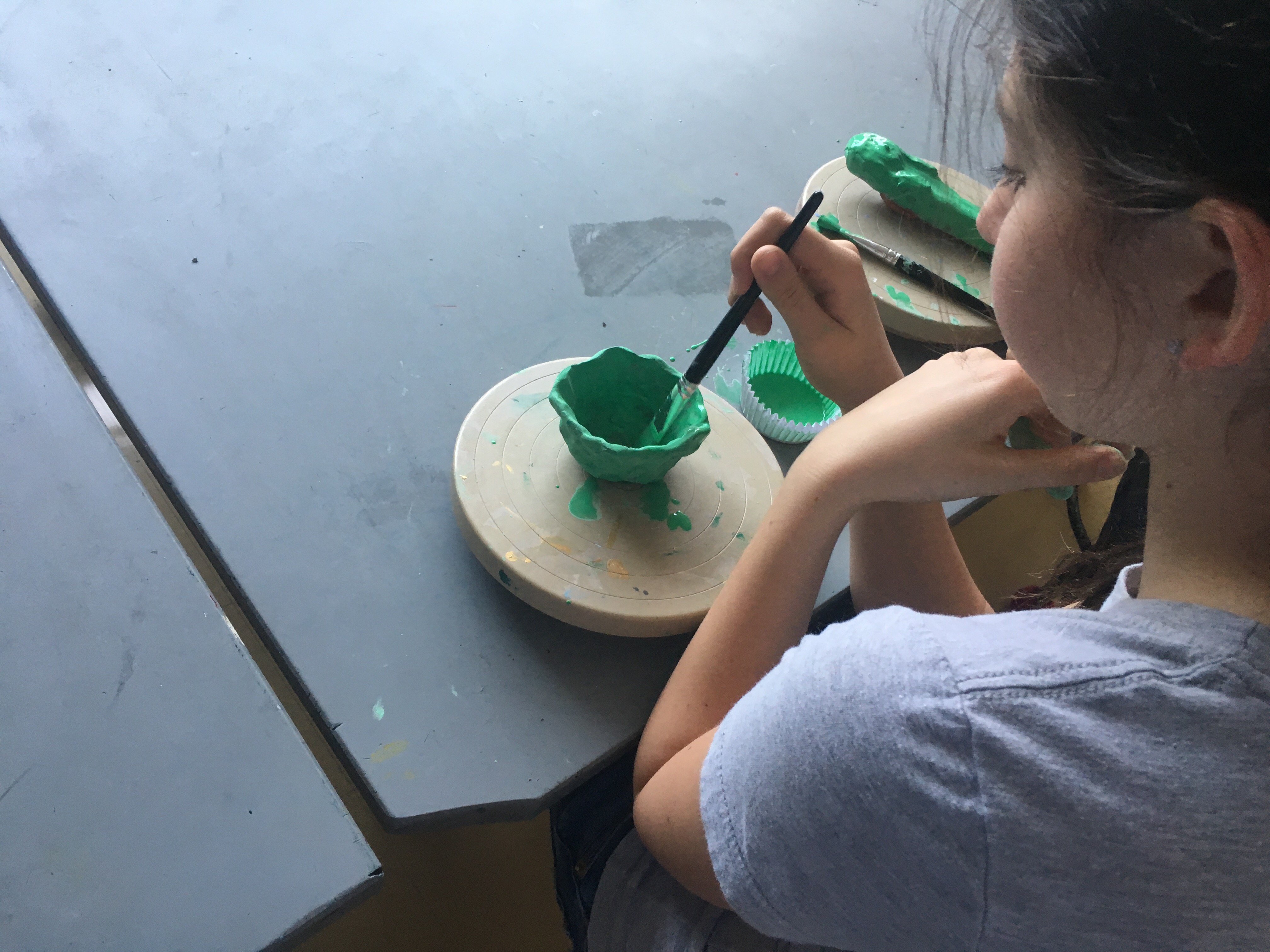
Ushabtis are little statues that Ancient Egyptians put inside there tomb. Ushabtis helped the dead person do work in the after life. You’d get as many Ushabtis as you can afford. The first thing I did to make an Ushabti was to shape my Ushabti to look like a human. The second step was to put markings that supposedly Egyptians put on them. The third step was to paint my Ushabti to make it look more realistic. If you wanted to you could of glazed you Ushabti, but I didn’t. After all the steps you could put your Ushabti in a Egyptian tomb. My favorite part about this project was putting the marks on because it was the most enjoyable. 
Canopic Jars
 In art we made Canopic jars and Ancient Egyptian pottery. On the left is my Canopic jar. There are normally four Canopic jars and my jars symbolizes the falcon head jar. Canopic jars would hold different organs like the liver, stomach, intestines, and lungs. The falcon head Canopic jar held the intestines. On the right is me glazing a piece of Ancient Egyptian pottery. We were making Canopic jars and pottery to go in the tomb. Pottery was put inside the tomb to hold food in the afterlife. My favorite part of this project is constructing my Canopic jar because I thought it was the most challenging part and it was very fun.
My Texture Paper Collage!!!!!!!!!!!!!!!!!
This is my Texture Paper Collage. We began making this collage by picking a color scheme of primary, secondary, or analogous color arrangements. An analogous color scheme is more than one colors that are next to each other on the color wheel. For example, I chose the analogous color scheme of red orange, orange, and yellow orange. Then we started to make six different texture papers with our chosen pallet, two for each color scheme. The different textures like bumpy, swirly, tiny circles, fluffy, rough, and smooth. Then we drew still pictures of animals and other objects displayed in my picture. I drew a turtle, a ball, and a vase/bottle. Finally we ripped up our texture papers and created our drawings into a collage. This was a project to test our knowledge on color schemes.
Zoetrope!!!!!!

This is my Zoetrope! A Zoetrope is a form of animation, instead of using the computer you draw a bunch of pictures, and spin them really fast (normally in a cylinder). The speed that the drawings are going in makes an illusion that the pictures are actually moving. You have to make each slide of the Zoetrope move in small increments to make the animation look clean, similar to stop motion animation. By using tiny circles I learned to eliminate the absent spaces. I think this is an example of my best work!
My Font!
I loved this project! I really enjoyed drawing samples for my font and the chance to actually use it. I hope that I can use my font while I’m writing on computer. My first idea was to make all the lines straight with no curves, and that lead me to my second concept which was to do the complete opposite, and try wavy. This is the theme I ended up using, because I thought it expressed my personality. If I would name my font it would be…drum roll please…wavy W.