My number is a square number.
My number is Odd.
My number is a prime number.
My number is a factor of 50.

My number is a square number.
My number is Odd.
My number is a prime number.
My number is a factor of 50.
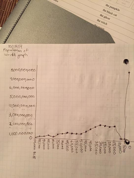
I Chose to make my graph this shape because I think that Anna was trying to trick us because I think that was the time that the black death was going around and that killed around 125 million people so that’s why I did what I did.
I was surprised that the population was so low but I didn’t have to alter my graph for it because I didn’t have a graph (that’s because I wasn’t at school the day before not I didn’t do the work). So that information helped me change what I thought originally to my graph now.
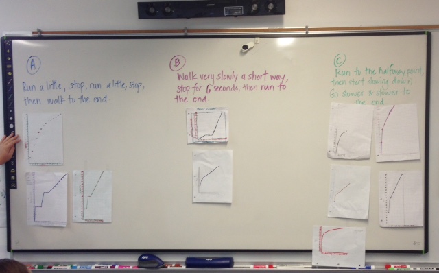
I noticed that the graph with no lines connecting the dots doesn’t fit in any category. I know that for 2 reasons, one, I know who made it and they said it went with C but that’s false because the first dot is not at 10 meters. The one that’s in purple marker in B doesn’t fit anywhere and all of the ones in C that don’t start at 10 meters don’t go anywhere.
I think that all of the graphs should have lines connecting the dots because the time doesn’t stop in between seconds time is still going so the dots having lines connecting makes sense. So now you can see what’s happening in between.