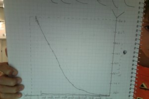
 This is my graph. I chose this shape because I thought that the population slowly got bigger until it got to the point we are at now. I was right, but my data was wrong. At 8,000 B.C.E, I’m at 5,000,000,000, not 5,ooo,ooo. When my graph was a t around year 2000, I put some population drops because of war. But now that we got the information of the population at year 8,000 B.C.E, I realized that the population pretty much goes strait up from then on. My population drops in my mind are not drastic enough, so I need to make a lot of changes.