For the past few weeks in art class we have been working on photo shopping an image of our choice. I haven’t used photo shop that much before we started this class, so I decided to try out different features and try to make it look interesting. For the background I thought the image was fun and I could come up with a fun idea of how to photoshop and add more to the image, so I took some random foods and tried to make it look like it was part of the art. The principals of design I have are pattern, contrast, harmony, proportion/scale, and rhythm/movement. I have pattern because I have multiple foods with shadows in the image. I have contrast because I have the light colors, but also the shadows. I have harmony because I have multiple shades of color that make the image look like it’s a whole, and the shadows make it look like the foods aren’t just floating in the air because there are shadows. I have proportion because all the foods and background aren’t the same size and it makes it look more realistic. And I have rhythm movement because there are people in the background taking photos.

Category Archives: Art
Value chart post
 In art art we just finished making value charts. Rohan gave us a question about our value chart to answer. Mine was what helped me center my chart in the center of the paper.
I tried to to be exact with the measurements, so I measured the distance of where Rohan’s value chart was from the edge of the paper. It was around 1 1/2 inches. After measuring on my paper, I left marks where 1 1/2 inches was from each side of the paper. Then I used a ruler and started to make the boxes!
Wire Sculpture
 My wire sculpture is my favorite piece of artwork that I’ve done this year. I like this project because it was challenging to make a body just out of wire, and a certain length. I think trying to make each body proportion the same was hard, but I liked it because you had to be really concentrated so you wouldn’t mess up. And I really liked how the ending product looked!
Map Project Artists Statement
I’d like to name this piece of art Map of Freedom. I named it Map of Freedom because the sculpture is of a freedom tower, and there is map covering the sculpture. I created this piece of art by cutting out pieces of foam board, and then using pins to pin the pieces together. Then I cut out important places in New York to me, and cut the map in the shape of each panel and glued them on. To finish it off, I mod podged the whole sculpture so there would be a little shine. Some things I learned while creating this was that you have to be very precise to fit things together or else your project will look really bad and it wont look like what you want it to. My favorite part is how it is 3D and you can see it from any perspective. If I could change something about this, I would make the panels fit to each other more because some pieces are bigger than others, and it’s a little uneven. While I was making this I was surprised that the whole sculpture stayed together and it was super sturdy! Something else I want to share about this artwork is that the project is really fun, but challenging!

Art Post
This is what my final piece looks like. I was going to do buildings below the building, but I wasn’t really sure what I would represent since I represented almost everything on the freedom tower. I can still do a little bit of cleaning up, like gluing down the map better. After I glued on the map pieces I mod podged it over so there would be a little bit of a shine on top. It was challenging to make this project, but once it was done I think it looked good!

Art Map Project
In art we are making a type of art with a map. We can choose any style we want to make and just be creative. One requirement is to show a place that is important or that represents you from the map. I decided to make a model of the freedom tower, and each side will represent a place that is special to me. Next class I will finish cutting out pieces of foam board, and then use mod podge to glue the maps on to the foam board, the mod podge will also make the map look a little bit shiny. One place I will represent on my project is where I go to school, since the map doesn’t say LREI, I will take a pin and put it right where the school is and then write what it is.
Fabric Collage
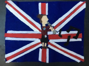
This is my fabric collage for medieval guilds. I am in the music guild so I had to represent that I am in the music guild and who I am. I decided to do a side view of my character playing an instrument. I actually learned how to do side views from Kaya!
Geometric Pattern
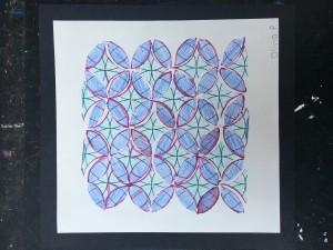
This is my geometric pattern! It was a little harder than other projects because we had to cut out each shape of the paper out and then glue it onto another piece of paper. But the ending looked really cool, so it was worth all the hard work! 
Illuminated Letter
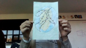
This is my illuminated letter. We looked online at different ones and then used those as an inspiration for our letter. Most of the time Illuminated letters are used as the first letter of a story. They are the big letter at the beginning of the stories. 

