Category: Art

Digital Art Poster

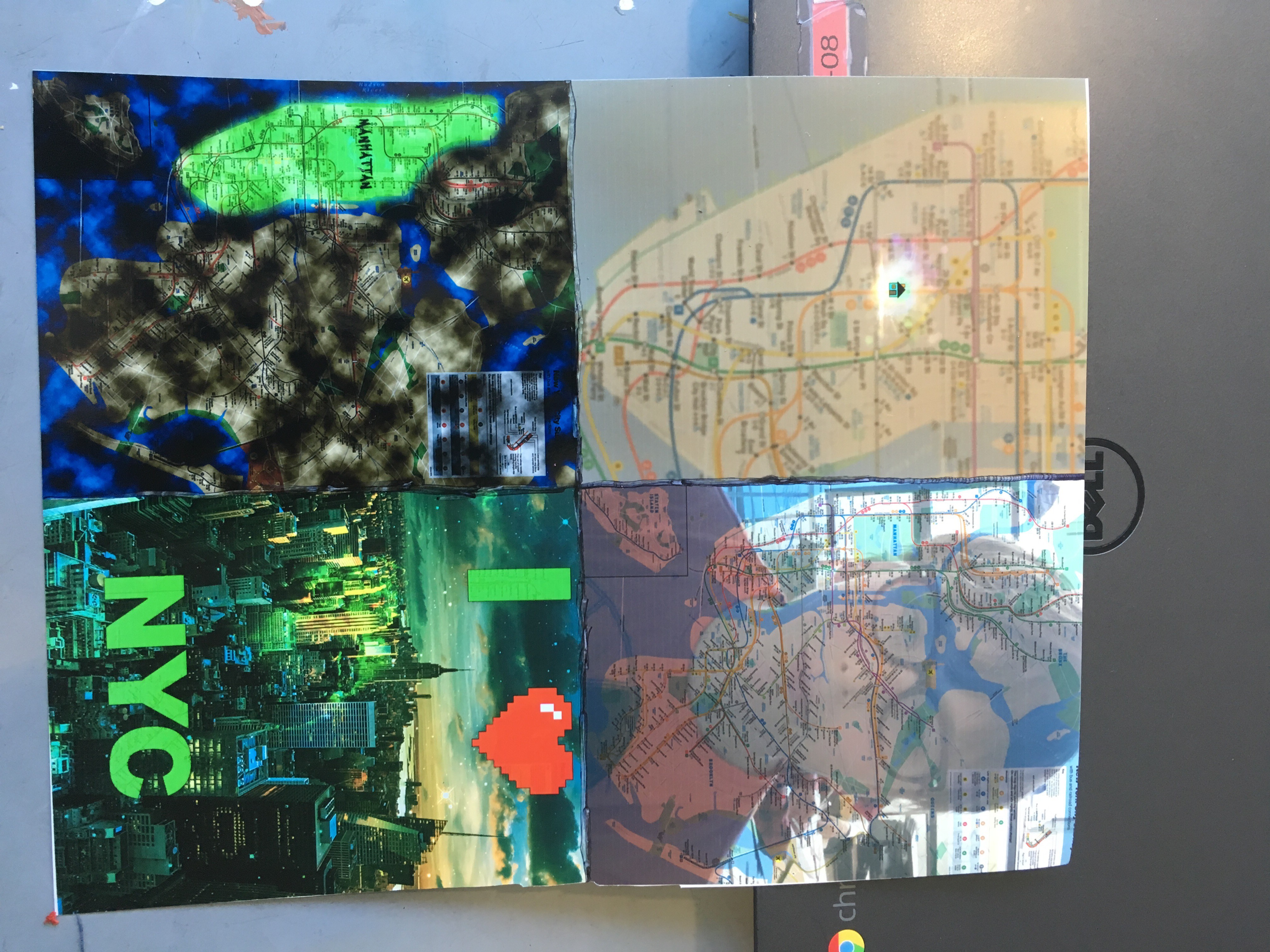
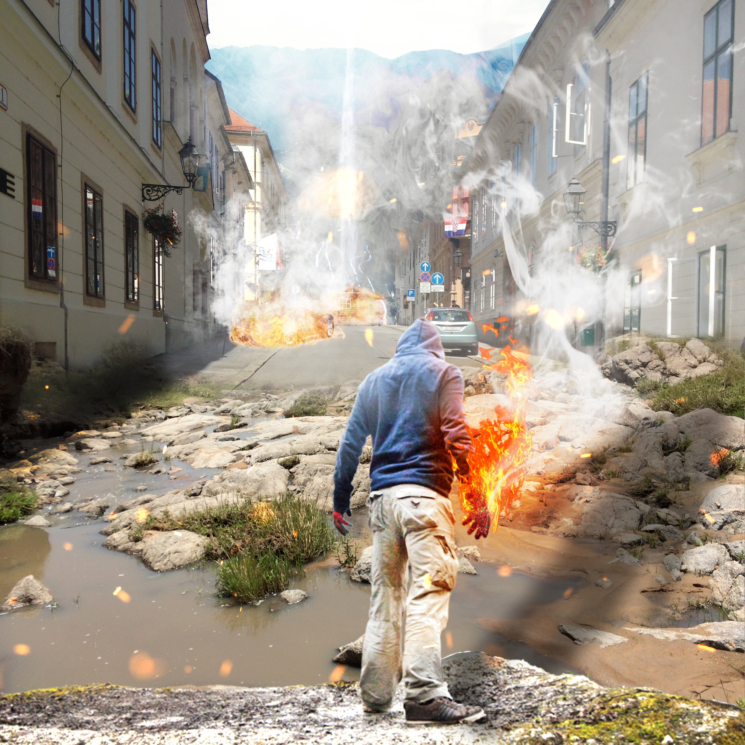
This digital art poster depicts a man with a fireball in his hand looking out into a street in Zagreb, Croatia. At the end of the street there is a house on fire and behind that there is a beautiful medieval countryside. There is also a mystical heavenly waterfall. The ground that the man is standing on is a puddle with rocks and grass from Tanzania, Africa. There is also a red Ferrari on fire. There is movement because your eye shifts from looking initially at the fireball, to the Ferrari, and then to the house, because of the fire and how far away the element is. There is also emphasis on those different elements created by the fire. There is balance because of the regular arrangement of the wisps of smoke. There is proportion and balance shown through how the person and the house are completely different sizes, but balanced to look as if the person is bigger, because of the perspective in distance.

My Eye Drawing


The of this piece is Olives. It is a photo realistic drawing of my eye. I created this piece of art by using a variety of different pencils and a blending stump. I used many different drawing techniques such as hatching and crosshatching. I learned many things while making this piece, such as when to hatch and when to crosshatch, and how the blending stump completely transforms your drawing. My favorite part of generating Olives is using the blending stump. It is really cool how it smooths out the line segments. If I could change something about it, it would be the highlight in the eye. It just didn’t come out the way I wanted it to. While making it I was surprised about how easy the whole process was. If I had seen the final product a year ago, I would have never had thought that I had the capability of making it. But I did, and I am proud of myself. This piece is called Olives because my name is Oliver, and olives are round like an eye.

Art Value Charts

In Art we worked on our value charts, which will help us with our technique for our realistic eye drawing. In this photo I am demonstrating a technique to create value. This technique is called cross hatching, which is when you cross line segments to create value which can be applied to pretty much anything in the drawing, such as highlights, shadows, and mid tones. If you want the value to be smooth, then you can smooth out the cross hatching with a blending stump, which will blend the line segments together.


Map Art Piece

Oliver Map Project 4


I call my piece “Quarters”. I created this piece of art by using Adobe Photoshop CC 2015 edition on a computer. I developed my understanding of types of photos that would compliment each other when you blend them together. I also learned a lot about the nyc map in general by looking at it. My favorite part of my piece is the part where the rest of the city is dark and cloudy and manhattan is bright green and clear. If I could change something about it, I would be the way it printed out on regular paper because when I printed on regular paper it looked very muddy. While making it I was surprised about how great everything came out looking!. Something else I wanna share about this project is how fun it was for me. I have been using photoshop for three years and I feel like with this project I got to show how much I know.


Map Art Favorite Piece

Oliver Map Project 4

The thing about this project that made it my favorite is it’s flexibility. You could do anything you want to represent the map to you. The thing that I did to make it my favorite is my idea to make the art digital. I love digital art and I felt like doing this project allowed me to share what I know.

My Map Art

Oliver Map Project 3This is the final draft of the map art that I have been working on in art. I made a post about it in the past and I have to say I am impressed with myself. I went beyond my own expectations. I am going to print it out on a big piece of paper since when I printed it out on the small one with the lab printer it got the colors wrong. I took out the 3d text since it didn’t make sense with my project. I decided to name my piece Tough Love. Since I love the city because of its faults. It is a confusing concept, but it means something to me. Today in art we shared our final work with the grade in a similar fashion as the first time. I wish that more people gave me feedback because I felt that the feedback that I got was repetitive, but helpful. Most of the comments said that the colors were dull in the print. I acknowledged this and didn’t do anything about it because the print that I displayed was not the final print. A few of the other ones were just complaints that they didn’t understand. And that is okay, but I am not going to change my piece based on their understanding of my artwork. All in all this was a really fun project and I am looking forward to doing more art projects like this in the future.

Art – Map Project

Screenshot 2016-05-11 at 9.51.59 AMScreenshot 2016-05-11 at 9.52.20 AM

For my map art piece I chose to make it digital. I had a bunch of ideas on what to do and I couldn’t decide on one, so I just decide to put them all side by side! I am not up to that part yet though. I just finished creating my 3d text piece. Anyway, the way I will put them next to each other is by fourths. I will cut the final work into four pieces. The first thing I worked on was my blur piece. At least, that’s what I call it. The subject of the piece is a focused in on area, which is my home, that is full of light and has a cartoon house on it. The area there is colored green, which is my favorite color. The background is colored brown, which is my least favorite color. The piece with my face on it is a regular map mixed in with my face. I did this because I feel like I know the city well and that I can relate to it. My third piece has green text (which again, is my favorite color) with a blurred out background of the city. I chose to make the text 3d because I think that the city stands out  from the rest in the world. I also made the text really big and bright because the city also has those characteristics. That is where I am at right now. I am not sure what I am going to do for my final piece but I really want it to stand out from the rest. That is where I am at with my map art project right now.

Illuminated Letter

IMG_1445


There is an ‘O’, shining with a pale yellow, colorful flowers entangling it. There is a blue owl, with curious eyes, perched on the inside of the ‘O’.


That is what I made. It is a European medieval illuminated letters. They decorated the cathedral windows to make up stories from the bible. each one was unique, and very pretty. The monks handmade them out of dyed glass. I chose to create an ‘O’ because my name is Oliver. I am very proud of my piece even though it was very challenging to create.

Geometric Pattern Piece

Oliver Geo 1 Oliver Geo 2

These are some photos of me doing a medieval Muslim geometric pattern piece. Medieval Muslim artwork is unique because it is very simple, yet complex. It also has no religious representation of angels, Muhammad, or God. There are also lots of geometric patterns and mosaics. That was what we were working on. Fig 1 shows me laying out the different shapes into a pattern, but when I finish,  I will completely rearrange the shapes on a separate piece of paper (Fig 2).

Guild Collage

Oliver Fabric 2 Oliver Fabric 1

In art we have created collages that represent something about our guild. I am in the arms and armor guild. In my collage there is a bow, quiver, and a letter with a ribbon on a table. A collage hand is also on the table. In the first photo I am sketching out what my collage will be. In the second photo I am gluing down the quiver to the table. I am proud about what my piece has become because I feel like I really symbolized what my character in the guild is all about.