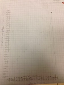
This week in math, we have been thinking about how many people lived in the past 100,000 years. We were asked to try and make a graph that explains how the world’s human population has grown and shrank in the past 100,000 years. As you can see, my graph is pretty steady until the end where it goes totally up. Since my graph looks pretty much straight, that means that there hasn’t been too much change in the human population. At the end, where my graph went completely up, that means that the human population went WAY up. I had a lot of editing to do on my graph (the graph that you see). At first, I slowly started going up, but then, I was told that 8,000 years ago, there were only a few million people living on earth. The human population grew so much, because now, there are almost 8,000,000,000 people on earth and it has only been 8,000 years. It is so interesting that the human population grew so much in the past 8,000 years.