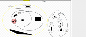
 This is my polygon Venn diagram. A Venn diagram is two or more circles that connect in different ways. If they overlap it means that there are three categories. Sometimes it can be one circle inside of another or the circles could not even connect. What we had to do is sort certain polygons in their category.
Category: Chaney
(Untitled)
My number is a factor of 960
My number is a multiple of 3
My number is two digits
The sum of the digits in my number is 6
Population Graph
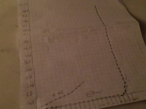
 This is my graph of the population of the world from when the first human evolved. The reason why there is a big swoop is because I finished it at home and I forgot all the information on the board in school. The reason why there is a big incline is because in that area the death rate was very low but the birth rate was staying the same. Also another reason why is because The population is going up in shorter amounts of years. Our first billion was in 1800. One of the reasons why on the bottom the population is not going higher or lower is because it is taking longer amounts of years fr the population to go up.
(Untitled)
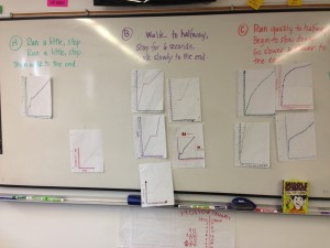
 I notice that the graphs for story b all look like a lightning bolt because it has a stop in it. I notice that in story c all the graphs have a curve in them because they all go up by different number each time. I notice in story a all of the graphs have two stops in them because in the story you are supposed to stop two times. I also notice that all the graphs look different. Finnally I notice that they all go up by different numbers.