My First Composition
This is the first piece of music I ever made. It was a little bit hard to make all of my notes not be clashes, but I finally did it. Hope you like it.
This is the first piece of music I ever made. It was a little bit hard to make all of my notes not be clashes, but I finally did it. Hope you like it.
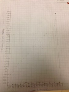
This week in math, we have been thinking about how many people lived in the past 100,000 years. We were asked to try and make a graph that explains how the world’s human population has grown and shrank in the past 100,000 years. As you can see, my graph is pretty steady until the end where it goes totally up. Since my graph looks pretty much straight, that means that there hasn’t been too much change in the human population. At the end, where my graph went completely up, that means that the human population went WAY up. I had a lot of editing to do on my graph (the graph that you see). At first, I slowly started going up, but then, I was told that 8,000 years ago, there were only a few million people living on earth. The human population grew so much, because now, there are almost 8,000,000,000 people on earth and it has only been 8,000 years. It is so interesting that the human population grew so much in the past 8,000 years.

Today, in Social Studies we did a really interesting project where we got a bunch of cards saying lots of different things that happened in the history of the world and then we were asked to put all of the cards in chronological order starting from the start of time. When my group started placing our cards, we had a little bit of confusion about what came first: When the moon hit earth, or the cambrian explosion. We decided to put when the moon hit earth first because when the moon hit earth, the earth was full of lava.. When me and my group were putting these events in chronological order, the whole history of the world really came together. Before, I thought a bunch of things happened and did not really understand why, or the transition into something big that happened. Arguing with my group about what came next actually helped me learn more about the history of the world.

I think atoms look like this because we were watching History Of The World In Two Hours and the atoms looked like this. It was a little bit challenging making this because I had a really good picture in my head of what an atom looks like, but when I saw what shapes where in Tinkercad, the shapes made it hard for me to show the picture I had in my head. I was thinking a lot about trying not to think about what the most realistic atom would be, but what I thought an atom looks like.
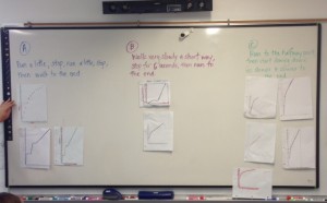
Today in math, we were making graphs based on three different problems. All of the problems were about different ways that people walked 20 meters. We got to choose which problem to a graph on. After we made our graphs, we mix and matched them and we were each given a graph that was not ours. Then, we had to put the graphs that we were given, up on the board, based on what problem we thought that graph was about. The way that we sorted out the graphs was that we saw the shape and the shape of the graph effected the meaning of the graph and what running story to put the graph in. If you look really closely at the picture, you can see that if two graphs are in the same category, they probably look pretty similar. When I looked at the board, I noticed a couple of things. I noticed that all of the problems that we were given to graph about were very similar, therefor, not a lot of the graphs were put in the wrong place. For some of the graphs, when people were putting them up on the board, a lot of people did not notice that the person stopped a little bit, so they placed them not knowing that the person stopped for a few seconds. I could say so much more, but then this post would take hours to read. I hope you all enjoyed this problem just as much as I did.