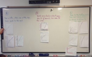
I notice that most groups did story C, some of the groups did story A, and the least amount of groups did story B. Some of the graphs don’t make sense to me because they don’t start at the bottom or there are dots at the bottom, but no lines. Some of the graphs are curved and some of the graphs are straight. It looks like some of the graphs are still in the wrong place because there is a curved graph under the A story. All the graphs look different. Even the ones that are for the same story. I think we should all say which graph was ours and work out all the problems about them.